
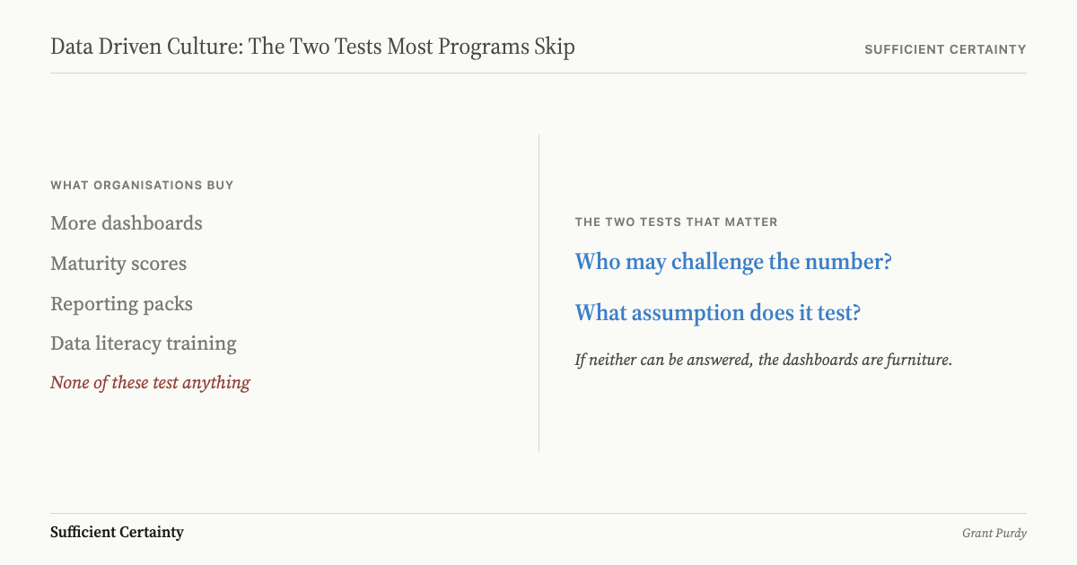
A data driven culture is not a programme that installs more dashboards. It is a discipline where anyone in the organisation can challenge a number and ask what assumption it rests on. Most culture programmes add tools and training without adding the two tests that separate evidence from decoration.
In a 2026 benchmark survey of senior data and AI leaders, 93.2% said culture and change management were the main impediments to adoption, while only 6.8% blamed technology. That rang true to me at once. In my experience, teams asking for a data driven culture already have the dashboards; what they do not have is a protected way to say the metric is weak, stale, or tied to the wrong outcome.
The phrase usually gets wheeled in to bless more reporting. Vendors like it because a behavioural failure can then be sold as a platform upgrade. Consultants like it because dashboards move through procurement more easily than disagreement. The same pattern gets more expensive in big data decision making, where volume makes the weak assumption harder to challenge. I care about a rougher test: can somebody in the room say the number may be wrong, and still have a career tomorrow?
A data-driven culture is an organisation's habit of linking evidence to decisions and allowing people to challenge that evidence before and after the call is made.
Most Data Driven Culture Programs Teach Deference
The 2026 AI & Data Leadership Executive Benchmark Survey matters here because it shows the problem was never the kit; organisations still buy more of it because tools are easier to approve than challenge rights.
I watched a chief data officer present a quarterly pack to a board that had not changed its headline metric in three years. The lag indicator had stopped moving, but nobody asked which numbers still mattered. The pack was tidy, the slides were consistent, and the room treated consistency as proof that the decision basis was sound. It was not. The metric had outlived the strategy it was built to track, and everyone in the room knew it, but questioning the pack meant questioning the person who commissioned it.
I have sat in meetings where the reporting pack was treated like a sacred object while the decision itself kept sliding. The pattern repeats at scale: three organisations with green dashboards still made the wrong call because nobody questioned the assumption underneath the headline metric. The room had charts, a chief data officer, and enough colour coding to calm an audit committee. What it did not have was permission to ask whether the headline metric was stale or pointed at the wrong consequence. I unpack the wider pattern in the wider case for data-driven decision making, but the short version is that the pack becomes the symbol of seriousness and the person who questions it becomes the problem.
Once that habit sets in, people hide behind maturity scores because that spares them from naming who may challenge the pack, and it keeps the sponsors comfortable while nothing important gets reopened. That is what many programs call culture.
A Data Driven Culture Needs the Right to Challenge the Data
The July 2025 Post Office Horizon Inquiry report is a vicious example. Horizon rolled out from 1999 to early 2002. Fujitsu employees knew Legacy Horizon could generate false data, senior Post Office employees knew or should have known it, and people were still prosecuted or forced to cover losses as though the machine had testified under oath. That is what a broken evidence culture does. It treats system output as cleaner than human complaint, which is wonderfully convenient if you are the institution doing the accusing.
The same sheltering instinct showed up after the 737 MAX crisis. The FAA's expert panel report found a disconnect between Boeing senior management and the rest of the organisation on safety culture, and employees doubted that reporting systems really protected open communication or non-retaliation. In plain English, the machinery buffered management from bad news and let the company pretend challenge rights existed while the people closest to the danger had reason to keep their heads down.
In my experience, that is the real test: how much contradiction can the organisation bear before somebody's career starts wobbling? Once frontline staff expect punishment for challenging the instrument, the evidence that reaches the top has already been politically filtered, so a clean dashboard tells you very little about whether the decision basis is sound. Leavers filter too: exit interview analysis records what departing staff felt safe to say, not always why they went.
Pick the metric nobody challenges and write the assumption your culture treats as too settled to question. Start the Walk →
A Data Driven Culture Names the Assumption Under the Metric
Roger Estall and I wrote Deciding because we had both seen competent people buried under paperwork that looked rigorous and still left the decision hanging. The question I keep asking in the Universal Decision-Making Method is less elegant and more useful: what exactly is this metric standing in for? Every chart borrows authority from someone's judgement about what was counted and whether it still matters. Leave that judgement hidden and the metric struts into the room wearing certainty it did not earn.
That is why I keep dragging numbers back to their assumptions. If the sales forecast only works if customers swallow a price rise, say so. If the service score only works if staff code incidents the same way every week, say so. Once the assumption is named, people can attack it without being treated as disloyal. I once sat with a team whose service score had been green for eleven months. When I asked what the score assumed, it turned out the coding rules had changed in month three and nobody had updated the baseline. The green light was real arithmetic on a dead definition. Once we named that, the room stopped defending the score and started asking what the service commitment actually required. Hidden assumptions are marvellous if you want the chart to end the argument, especially when your status rises with the chart.
I get impatient when people separate quantitative from qualitative evidence as if one lives upstairs and the other comes in through the tradesman's entrance. The number already contains human judgement about definitions, timing, and relevance. I wrote more about that in my piece on quantitative and qualitative decision-making, but the practical point here is that a culture which cannot interrogate the judgement inside the metric is only pretending to respect evidence.
The Best Example Looks More Like a Stop Cord Than a Dashboard Rollout
The positive case here is Virginia Mason's patient safety alert system, because it built something closer to a stop cord than a dashboard program. Participation in its safety survey rose from 16% to 88%, and professional liability claims later fell 74%. Those figures are useful, but the virtue was not the survey score; the virtue was that a nurse could interrupt the process before management turned harm into a tidy monthly slide.
That is why I keep coming back to decision monitoring. Evidence is most useful when it can reopen the decision while there is still time to do something, not when it arrives months later as a memorial to everybody's caution. Broken systems adore quarterly packs because by then the damage is old news and nobody has to own the assumption that failed.
Without those two questions, the default is predictable. The organisation buys another platform, the vendor supplies another maturity score, and the people closest to the evidence learn that silence is safer than contradiction. I have seen that cycle run three times in the same company across five years, each time with a new label and the same unexamined metric underneath.
When a chief executive tells me the organisation needs a data driven culture, I ask two questions. Who may challenge the number, and what assumption is that number supposed to test? If those questions cannot be answered, the dashboards will keep multiplying and leadership accountability will remain a slogan rather than a practice, because nobody owns the assumption behind the number.
You could roll out the next dashboard program and still leave the assumption underneath it untested.
Work through your decisionNo sign-up. Just pick your decision and start.
Grant Purdy is the co-author, with Roger Estall, of Deciding (2020), and the architect of the Universal Decision-Making Method.