
A fishbone diagram organises possible causes into tidy branches and gives a pressured room the feeling that investigation is under way. It cannot tell the room which branch matters enough to act on first. When time is short, the neatness of the chart becomes the enemy of the judgement call.
In May 2016, NHTSA expanded the Takata recall by another 35 to 40 million inflators. A fishbone diagram could have listed possible causes. It could not have told investigators which interacting failure mattered enough to act on first, or which vehicles carried the bigger risk.
That is the trouble with this tool. An Ishikawa diagram, also called a cause and effect diagram, is useful for sorting possible causes. It gets dangerous when a pressured room starts treating the branches as findings, because the picture looks finished long before the thinking is.
A fishbone diagram is a cause-and-effect chart that groups the possible causes of a problem into categories so a team can investigate them systematically.
What a fishbone diagram actually gives you
In my experience, this tool is good at one job. It makes people put their guesses where everyone can see them. It is much weaker when the room needs to decide which guess deserves money or downtime. OPM's root cause analysis guide treats it that way, and CMS does too. Both use the diagram to gather candidate causes, then move quickly to evidence and choice.
The usual categories are Man, Machine, Method, Material, Measurement, and Mother Nature. Call them the 6 Ms or call them something else, the point is still grouping, not proving. The categories help because they stop the lazy habit of blaming the nearest operator. The problem is that once the bones are filled, weak guesses start to look rigorous. Everyone loves a tidy skeleton on the wall, especially when it saves them from saying, plainly, "we still do not know."
I still use the tool when a team needs to get practical knowledge out of people's heads and into the open. It can also stop the senior person in the room from declaring the answer before the people doing the work have spoken. That is useful. It is not the same as knowing what to fix.
Why a fishbone diagram does not tell you what to fix
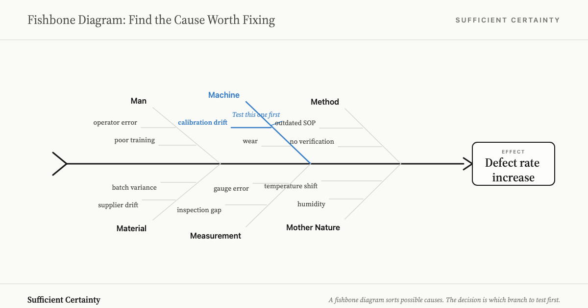
The basic defect is simple: most branches are assumptions dressed up as causes. Write "poor training" or "supplier drift" on a bone and watch the room start talking as if the case is closed. Nothing has been established. Someone has merely written a sentence in marker.
AHRQ's root cause analysis material is useful here because it says, politely, what many organisations refuse to say out loud. Teams complete the analysis, choose weak actions such as training or another checklist, and then act surprised when the underlying problem returns. I see the same failure in companies that congratulate themselves for finishing the workshop, and in the report-out that ends a kaizen event. The safe answer usually wins because the unsafe answer would touch design or headcount. That is why this wider discipline starts with the decision, not the picture.
When someone asks me whether the diagram worked, I use a blunt test. Can the room name the decision, and the branch it is prepared to test first? If not, the exercise produced a neat artefact and a better alibi than answer.
Choose the branch your team wants to fix and test which cause you are actually willing to bet on. Start the Walk →
How I turn the diagram into a decision
Once the branches are up, I stop the meeting and force one sentence onto the table: what are we deciding now? Are we stopping the line, or changing the inspection step before next shift? Most sessions dodge that sentence because it drags responsibility into the room, and responsibility is less popular than brainstorming.
After that I use the logic of the Universal Decision-Making Method. First I make the room Frame the decision in plain language. Once that is clear, we Develop options that differ in the real world. Only then do we Recognise assumptions by taking the favourite branch and asking what would have to be true before we touched the process.
Roger Estall and I wrote in Deciding that logic improves the moment assumptions are made visible. That is what most fishbone sessions skip. Once the room has to say what evidence would support "calibration drift" or "operator error", half the bones lose their glamour very quickly.
What survives that test gets judged on two things. Is it big enough to explain the failure, and are we sure enough to act without kidding ourselves? Teams are very good at certainty theatre. They will spend an afternoon polishing labels if it helps them avoid a hard call.
OSHA's incident guidance makes the same point in tougher language. One example kept blaming operator error until deeper work exposed weak instrumentation and a maintenance system left to rot. I have seen that pattern more times than I care to count. The first explanation is often the one that protects the budget holder.
Then comes Step 5, Design monitoring. If we change the inspection step, what signal tells us the cause was real? If retraining is the chosen action, what result would tell us we blamed the wrong thing? The short version is this: do not let the room leave with a fishbone and call that progress.
Takata shows why one cause is seldom enough
Takata is useful because it ruins the fantasy of one heroic cause. NHTSA's 2016 recall expansion added another 35 to 40 million inflators to the 28.8 million already under recall, and its internal investigation described interacting contributors such as manufacturing variation and moisture exposure, with operating conditions making matters worse.
The diagram could have organised that mess. It could not have settled the real judgement, which was where to intervene first and which vehicles had to move to the front of the queue. NHTSA prioritised replacement by relative risk. That is what real decision work looks like when the stakes are ugly.
Why do organisations keep hunting for a single culprit anyway? Because one-cause stories are cheap. They spare senior people from admitting that several weak decisions lined up, and they let everyone pretend one training session or one memo will do the job. The people who benefit are the people who would otherwise have to pay or explain themselves.
I see the same habit in defect reviews and safety investigations. The room circles the most visible branch, usually the one with the lowest political cost, and calls it a root cause. In my experience that is not rigour. It is office survival wearing a hard hat.
When I would use a fishbone diagram, and when I would not
I would use one when the problem is close to the work and the decision is near. A defect trend on one line, or a service handoff that keeps breaking in the same place, suits the tool. It gets real knowledge onto the wall before memory and status start rewriting history.
I would not use a fishbone diagram when the room is still arguing about the decision itself, or who has the right to make it. In that situation the chart becomes a respectable distraction. Start with the decision in the wider sense of strategic problem solving, then decide whether this tool is worth drawing at all.
If the cause chain is genuinely linear, 5 Whys can be faster. If the investigation needs evidence gathering and follow-up, whether inside a standalone report or a single-page A3 report, this tool is only one small part of the job.
When the fishbone does work, it works because someone in the room refuses to let the branches harden into conclusions. The value is not the chart. It is the moment a team looks at eleven possible causes and has to choose three to test before the end of the week. That choice forces honesty about what the team actually believes and what it can actually check. The branches left behind are not wasted. They are parked until the first three either prove themselves or collapse.
My test at the end of every session is the same. Can the room name the decision? Can it name the branch it will test first? If yes, the fishbone did its job. If not, the room spent an hour drawing a chart that looks like progress and is not.
You could fill the branches and still leave the room without a decision to test.
Work through your decisionNo sign-up. Just pick your decision and start.
Grant Purdy is the co-author, with Roger Estall, of Deciding (2020), and the architect of the Universal Decision-Making Method.