
I have sat in rooms where someone pulls up a dashboard, points to a metric that has turned red, and argues the team should reverse a decision made two weeks ago. The reasoning sounds right: the data says we should pivot.
The original decision was sound, the metric is noisy or lagging, but nobody in the room can articulate why "the data says" is not sufficient grounds to change course. I have chaired enough of these meetings to know how they end: whoever has the chart wins, whether the chart is relevant or not.
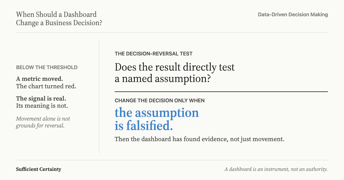
This is where most organisations get stuck. They treat dashboards as authorities rather than as instruments that test specific assumptions. A dashboard is a display of selected measurements at a point in time; whether that display should change a decision already in progress depends entirely on what assumption the measurement is testing and whether the measurement has actually falsified it.
The difference becomes clearer against real failures.
A dashboard should change a business decision when the data it displays directly falsifies a specific assumption the decision rests on, not because it shows movement in a metric.
When the Dashboard Signal Is Real and You Should Act
In November 2013, Target Corporation's security operations centre had a dashboard that worked exactly as designed. FireEye's intrusion-detection system flagged malware alerts beginning on 30 November; the monitoring system generated the signal, the Bangalore team escalated it to Minneapolis, and Minneapolis took no action. The alerts carried generic naming ("malware.binary") that blended with routine false positives, and alert fatigue turned a genuine signal into background noise.
The implicit assumption being tested was straightforward: our network perimeter is holding. The FireEye alerts directly falsified that assumption. The U.S. Senate Committee report on the breach concluded that Target had the tools and the data; the failure was a judgment failure, not a technology failure. Forty million credit and debit card records were stolen over two weeks while the dashboard showed exactly what had happened and nobody acted on what it showed.
When a dashboard signal directly contradicts a load-bearing assumption, and you can verify that the signal tests that specific assumption, the dashboard should change the decision. That is what makes the Target case so instructive: the security team had the signal, had the tools, and had every reason to act. Alert fatigue and the volume of daily notifications meant a falsifying signal was treated as routine; the dashboard did its job and the humans overrode it by doing nothing.
When the Signal Is Noise and You Should Hold
On 6 May 2010, the Dow Jones Industrial Average dropped approximately 1,000 points in 36 minutes, then recovered almost entirely within 20 minutes. Every trading dashboard on every desk in every institution showed the same thing: prices were falling. The signal was real; the conclusion it invited was not.
The CFTC and SEC joint report found that a large mutual fund's automated sell algorithm triggered a cascading withdrawal of liquidity. High-frequency trading systems reacted to each other's signals rather than to underlying economic data, amplifying a momentary imbalance into a market-wide dislocation.
The dashboard was testing an implicit assumption: the market is pricing in new fundamental information. That assumption was false; the price movement was a structural artefact, not substantive evidence about underlying positions. That is the mechanism of a false signal: the number is real but the assumption it appears to test was never in play.
Human traders and institutional investors who held through the drop recovered fully. Those who sold on the dashboard signal, or whose algorithms sold for them, crystallised losses on phantom movement.
That is the opposite failure to Target: the signal showed real movement and the correct response was to hold. Target's perimeter assumption had been falsified by evidence of intrusion; the Flash Crash "new information" assumption was never supported by any underlying economic event.
I have seen organisations reverse sound commitments on exactly this kind of phantom signal, and in every case the post-mortem reached the same conclusion: the difference between the two outcomes was not the size of the movement but whether the signal falsified the assumption it was supposed to test.
Name the assumption your current decision depends on and check whether the metric someone flagged this week actually tests it. Start the Walk →
When the Dashboard Tests the Wrong Assumption
Between 2001 and 2014, General Motors received warranty claims, field reports, and customer complaints about ignition switches that could rotate from "Run" to "Accessory" during driving, disabling power steering, brakes, and airbags. The data existed across at least four internal tracking systems. Each system tested a narrow question: is this individual complaint statistically unusual for this model year? The answer was consistently no; stalling complaints did not spike above baseline when measured per model, per year.
The Valukas report, a 325-page investigation commissioned by GM's board, found that no one aggregated the data across model years, across platforms, or against the specific failure mode. The monitored metric (complaint rate per model year) was not the metric that mattered (cumulative incidents linked to a specific component failure mode). The dashboard was not lying; it was answering the wrong question.
That is institutional blindness dressed as data management. By the time the pattern was recognised, 124 deaths were linked to the defect, and GM paid a $900 million criminal resolution.
This failure sits beneath the other two. Before asking whether a dashboard should change a data-driven decision, ask what assumption the dashboard is actually testing. At Target, the assumption was identifiable and the signal falsified it. In the Flash Crash, the assumption was identifiable and the signal did not. At GM, the assumption being tested was the wrong one entirely; no amount of careful interpretation would have helped because the instrument was pointed at the wrong thing.
Roger and I documented the same pattern in Uber's acquisition due diligence (in Deciding, Chapter 8): every signal about collapsing synergies was visible across separate systems and nobody combined them into a view that could test the assumption the deal actually rested on. That is the cost of measuring the wrong thing.
Making the Call When a Dashboard Challenges Your Decision
When a metric moves and someone argues it should change a decision already in motion, the instinct is to debate the size of the movement. I have watched this happen across dozens of organisations; it almost always goes the same way. Someone points to a chart, someone else argues the drop is within normal variance, and the conversation becomes a negotiation about thresholds. That is the wrong conversation.
In my experience, the right question is whether anyone in the room can name the specific assumption the metric is testing. If nobody can, the metric is decorative; it may belong on a report but it does not belong in a decision conversation. Knowing which numbers matter before the call starts here: with the assumption, not with the number.
Even when the assumption is identifiable, movement in the metric does not automatically falsify it. The Flash Crash showed real price movement; the assumption it appeared to test (that markets were pricing in new fundamental information) was never in play. Distinguishing genuine falsification from noise is central to working with assumptions in decision making, and it cannot be resolved by looking at the size of the shift.
Then there is the deeper failure: testing the wrong assumption altogether. GM's systems answered their designated question correctly for thirteen years while 124 people died. If the metric tests a narrow version of what actually matters, the dashboard cannot tell you what you need to know, regardless of what it shows. An A/B test can crown a winner the same way, on a metric that improved while the product got worse.
I have reviewed post-incident reports where this pattern repeats (the data was there; the question it was answering was not the question that mattered), and it is always the hardest failure to see from inside.
These are the questions the Universal Decision-Making Method asks at a specific moment: the moment someone waves a chart and says the data demands a change of course. Size is irrelevant if the assumption being tested is the wrong one; a small signal that falsifies a load-bearing assumption matters more than a large signal that tests nothing in particular.
You could reverse a sound commitment next time someone waves a chart at the room.
Work through your decisionNo sign-up. Just pick your decision and start.
Grant Purdy is the co-author, with Roger Estall, of Deciding (2020), and the architect of the Universal Decision-Making Method.