
In an experiment at Bing, Microsoft's search engine, a bug served users very poor search results, and two key metrics improved significantly: distinct queries per user rose by over 10 percent, revenue per user by over 30 percent. The test produced a clear winner on its own scorecard and concealed that the product had got worse. After an A/B test, before the winner reaches all traffic, decide how much certainty the rollout needs and whether the metric that won is what the decision is about.
An A/B test, or online controlled experiment, randomly splits users between a control and a variant, then compares a chosen metric to estimate the effect of the change.
A well-run A/B test isolates cause better than any report
A controlled experiment does something almost no other business evidence can. Users are assigned to control or treatment at random, so seasonality, a competitor's campaign, a news cycle or a shift in traffic mix hits both groups alike. Whatever difference remains was caused by the change. Before-and-after comparisons and cohort reports cannot make that claim, which is why the experiment isolates cause and sits near the top of any hierarchy of evidence-based decision-making.
It also corrects intuition, often sharply. Kohavi and Thomke (2017) describe a proposed change to how Bing displayed ad headlines that was judged a low priority and shelved for more than six months. When an engineer finally tested it, revenue rose 12 percent, worth more than $100 million a year in the United States alone. The people closest to the product had misjudged it.
Run properly, the test carries its own discipline. Sample size and duration are fixed before launch, so nobody stops the moment the chart looks good. The deciding metric is named in advance. Kohavi and colleagues (2012) call it the Overall Evaluation Criterion, "the metric that drives the go/no-go decisions for ideas", and recommend continuous A/A tests, which split users between two identical experiences to confirm the platform is not manufacturing differences of its own.
The output is compact: an estimated difference on the scored metric, an interval around it and a p-value. By convention a result counts as significant when the p-value falls below 0.05, matching the 95 percent confidence level most teams use. That tells the team the observed difference would be surprising if the two variants truly performed the same.
For a team working out which numbers matter before the call, few inputs to data-driven decision-making are as strong. The test has answered its own question well. Whether it has answered the rollout's question is a separate matter.
Name the result your winning metric is meant to stand in for, and ask whether anyone has seen the two move together outside a test. Start the Walk →
A p-value below 0.05 is not a rollout threshold
The 0.05 line is a statistical convention. It was never calibrated to any particular decision, and it does not move when the stakes do. A test on a button label and a test on a pricing page that will reach every customer are held to the same bar. The threshold belongs to the statistics, not to the rollout.
The American Statistical Association's statement on p-values (Wasserstein and Lazar, 2016) is direct on this. Business decisions "should not be based only on whether a p-value passes a specific threshold", and statistical significance "does not measure the size of an effect or the importance of a result". A significant lift can be too small to matter.
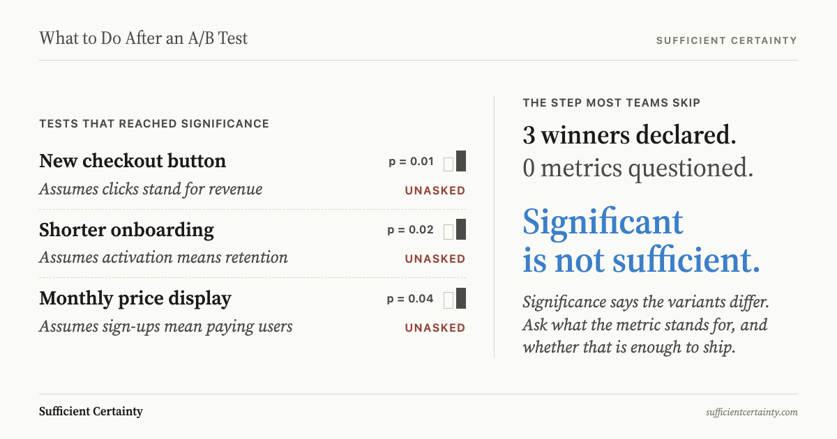
The ship decision also rests on more than the difference being real. A typical rollout after a winning test takes four claims as given: the variants differ on the scored metric, that metric tracks the outcome the organisation wants, the effect will persist beyond the test window, and the gain justifies the cost of rolling out. The test checks one of the four.
The second claim is the proxy problem. Clicks, queries and revenue per session are chosen because they move quickly and can be measured inside a test window. The outcome the organisation cares about, whether customers come back and stay, moves slowly and often cannot be measured there at all.
The third claim is the duration problem: a test that runs for a fortnight says little about month nine. Both are assumptions in decision-making in the plainest sense, taken as true because the test was never designed to check them.
When a Bing bug beat the control on queries and revenue
Kohavi, Deng, Frasca, Longbotham, Walker and Xu (2012) documented the case in a KDD paper on five puzzling outcomes from experiments at Microsoft, most of them on Bing. When the team set out to define the metric experiments would be judged on, it began from two long-term, top-level goals held at president and executive level: query share and revenue per search. Many projects were incented to raise them.
Then a bug in one experiment served users very poor search results. Both key metrics improved significantly. Distinct queries per user rose by over 10 percent, and revenue per user by over 30 percent. On the scorecard the organisation used, the broken variant was the winner.
The explanation is simple once seen. Worse results force people to search again, which lifts queries. They also make the ads relatively more relevant, so users click more of them, which lifts short-term revenue. The authors compare it to a retailer raising prices: revenue goes up for a while, customers drift to the competition, and lifetime value falls. Taken at face value, the metrics would have justified degrading search quality on purpose.
The deeper problem sat in the arithmetic. The team broke query volume into users per month, sessions per user and queries per session. In a controlled experiment the number of users in each variant is fixed by the design, so users per month, the component a better experience should grow, cannot be measured inside the test. The metric that won was not the thing the decision was about.
The paper's answer was to make sessions per user a key component of Bing's evaluation criterion, and to use revenue per user only with constraints on engagement. The statistics had been sound; the assumption behind the metric had not. It is a clean example of when a dashboard should change the decision, and when it should prompt a harder question first.
Check the metric and the window before shipping to all traffic
The trigger point is the moment before the winning variant goes to 100 percent of traffic. Two artefacts deserve a direct look.
The first is the scored metric. Write down, in one sentence, the outcome it stands in for, then name one way the metric could rise while that outcome falls. For Bing the answer was immediate: queries rise when search gets worse. If such a path exists, the result needs a guardrail metric, or direct observation of users of the kind covered in what to do after a usability test.
The second is the test window against the period the rollout must hold for. Hohnhold, O'Brien and Tang (2015) show the gap cuts both ways at Google. Reducing the mobile search ad load was substantially negative for short-term revenue, yet its long-term revenue impact was neutral once user learning, which can take months, was measured. Google went on to cut its mobile ad load by 50 percent.
Then set the threshold. A change that is cheap to reverse may need nothing more than the test. One that touches every customer for years needs more, such as a holdback group kept on the old version after launch. Sufficient certainty is set by the decision, not by the p-value. That is the real question behind whether data should decide or just inform, and it is a distinct step in the Universal Decision-Making Method, taken before anything is implemented.
How confident are you that the metric your A/B test was scored on still moves with the outcome the rollout is meant to improve?
Work through your decisionNo sign-up. Just pick your decision and start.
Grant Purdy is the co-author, with Roger Estall, of Deciding (2020), and the architect of the Universal Decision-Making Method.