
A balanced scorecard example with every measure green is not proof the strategy works. It is proof that the measures were chosen to confirm what the team already believed. The test of a scorecard is not coverage. It is whether any measure on it could tell you the plan has failed.
A few years ago a production director opened his laptop and showed me his scorecard. Four quadrants, sixteen measures, every one of them green. Production rate on target. Unit cost down four per cent against budget. Customer complaints inside tolerance. Training hours logged and signed off.
I asked him one question: which of those sixteen numbers, if it turned red next quarter, would change what the board decided to do next. He looked at the screen for a long time. He could not answer. What he had built was a textbook balanced scorecard example, and it could not tell him a single thing worth knowing.
That gap sits inside almost every balanced scorecard example published online. Search the phrase and you get galleries: forty-seven templates on one site, seven ready-to-use KPI sets on another, colour-coded boxes stretching down the page. Every one tells you what to measure. None tells you what would prove a measure wrong.
Before you fill in the grid, use four questions for choosing balanced scorecard KPIs. They help distinguish a measure that tests the strategy from a number that is merely easy to report.
If you are the one who has to bring a finished scorecard example to a leadership meeting next quarter, the pressure is not really about the boxes. Nobody in that room is going to fail you for using the standard four perspectives. They will notice, eventually, if every measure you present turns out to have been chosen because it was easy to track rather than because it tested something real.
A balanced scorecard example is a set of objectives and measures across an organisation's financial, customer, internal process, and learning and growth perspectives, showing how a strategy produces results.
A balanced scorecard example, with the assumption column added
Here is what that scorecard looked like once we added two columns you will not find in any gallery: the belief each measure depends on, and the single result that would prove it wrong. None of this needs new software or a consultant's workshop. It needs someone in the room willing to write the belief down before the meeting ends.
| Perspective | Measure | The belief it depends on | What would prove it wrong |
|---|---|---|---|
| Financial | Unit cost, down 4% against budget | The new line can hit that cost without cutting a corner the customer would notice | Warranty claims or returns rise in the two quarters after launch |
| Customer | New accounts opened against the incumbent supplier | The incumbent's customers are dissatisfied enough to switch on price and service alone | Win rate stays below one in five pitches after the third month |
| Internal process | First-pass yield on the new line | Existing tooling can run the new product without a redesign | Yield sits below 90% for two consecutive months |
| Learning and growth | Operators certified on new equipment | Two weeks of training is enough to reach rated output | Certified operators still run below rated speed at 60 days |
Every measure in that table is one already sitting on a hundred real scorecards. Add those two columns and the tool changes completely. A green cell no longer means the number moved in the right direction. It means the belief underneath the number has not yet been tested and found wanting.
A red cell stops being a surprise and starts being information: it tells you exactly which part of the plan to reopen, because you wrote down in advance what would count as evidence against it. Recognise assumptions, the third step in the method Roger Estall and I set out in Deciding, is nothing more exotic than this. Name the belief a decision depends on before you commit resources to it, so that when the world disagrees with you, you notice.
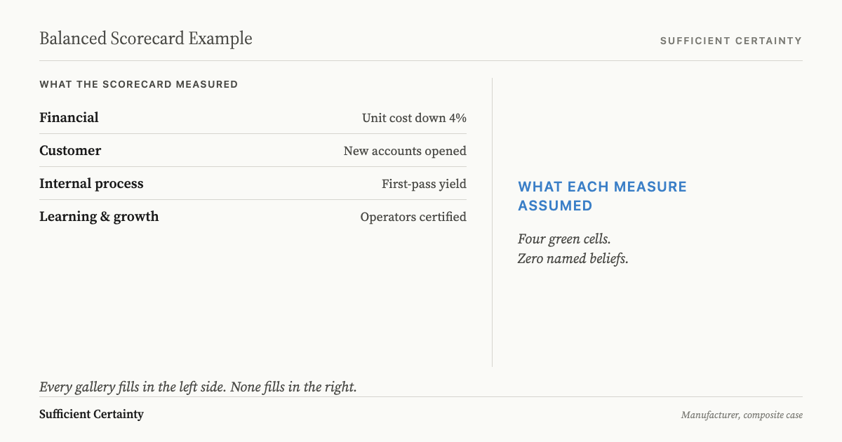
What every balanced scorecard example leaves out
Every one of those galleries repeats the same four boxes: financial, customer, internal process, learning and growth. The four perspectives are a reasonable structure. Robert Kaplan and David Norton built them to stop companies grading themselves on last quarter's revenue and nothing else, and that part of the idea has held up for three decades.
Count how many of the top results for the phrase use the word "assumption": none. Every competing page promises a completed artefact, a target number and a status colour beside each measure, nothing about what would turn that colour red for the right reason.
Take the production director's scorecard again. "Unit cost down four per cent" sat in the financial quadrant because unit cost is a financial number. Nobody had written down the belief underneath it, that the new production line could hit that cost without cutting a corner the customer would eventually notice. A number can be completely accurate and still be measuring the wrong belief.
The gallery never asks which belief a measure stands in for, because the gallery is selling a finished artefact, not a working one. Finished is what the template vendors, the BSC software subscriptions, and the consulting firms called in when a scorecard stops working are all selling. None of them profit from a column that admits the thing might be wrong.
Write the belief each scorecard measure depends on and the result that would prove it wrong, before the next review treats green as safe. Start the Walk →
The same scorecard, opposite outcomes: Boeing and Duke Children's Hospital
I go back to Boeing and Duke Children's Hospital whenever someone claims the four boxes are the safeguard. Boeing's own numbers after the 1997 merger with McDonnell Douglas told a clean financial story: production rate climbing from 42 aircraft a month toward 57, earnings per share rising, billions returned to shareholders through buybacks. The belief underneath those numbers was that engineering safety margins could absorb that pace without anyone having to say so out loud.
That belief was never written down as a belief. It was treated as background, the kind of thing everyone assumes because saying it out loud would sound insulting. So when Boeing re-engined the 737 rather than design a new aircraft, and needed a software system called MCAS to compensate for how the larger engines changed the plane's handling, the system shipped relying on a single angle-of-attack sensor instead of two.
That single-sensor design broke long-standing redundancy practice in aerospace engineering, and nobody with the authority to stop production for it did. In October 2018 Lion Air Flight 610 crashed off Indonesia. In March 2019 Ethiopian Airlines Flight 302 crashed on takeoff. Three hundred and forty-six people died across the two flights, and the fleet was grounded for twenty months.
Boeing's own board was not told about the Lion Air crash for ten days, which tells you which quadrant was actually being watched in real time. Every quadrant on the scorecard could have stayed green through the entire period, because none of them had a line asking what would prove the safety-margin belief wrong.
| Perspective | Measure | The belief it depended on | What would have proved it wrong |
|---|---|---|---|
| Financial | Production rate, 42 toward 57 aircraft per month | Engineering safety margins can absorb this pace | Safety incidents traced to schedule pressure |
| Financial | Earnings per share, rising | Shareholder returns do not require bypassing redundancy | A critical system ships with one sensor where two is standard |
| Customer | Aircraft orders, growing | Airlines will accept a new flight-control system with minimal retraining | Regulators or airlines flag the MCAS dependency before certification |
| Internal process | 737 MAX certification on schedule | Re-engining the 737 avoids new-airframe cost without adding risk | Test pilots report handling anomalies tied to engine placement |
Duke Children's Hospital ran the same four perspectives to the opposite result, and the difference was not the framework. By 1996 the hospital was losing eleven million dollars a year, and cost per case had risen 42% over the previous three years. Doctors watched clinical outcomes while administrators watched cost, and neither side saw the other's numbers or had tested whether the two goals were actually in conflict.
Chief Medical Director Jon Meliones introduced a scorecard that made the belief explicit before it made anything else explicit: that cost and quality would move together once the driver was waste and process variation, not the volume of care delivered. I want to flag the discipline in what happened next: he tested that belief in the paediatric intensive care unit first, as a pilot, before scaling it hospital-wide.
If length of stay had fallen while readmissions rose, the belief would have failed and the scorecard would have said so. Readmissions did not rise. They fell from 7% to 3% while average length of stay dropped 21% and satisfaction rose 18%. By 2000 the eleven-million-dollar loss had become a four-million-dollar profit. Same four boxes as Boeing's. The difference was that Duke wrote the belief down and built a way to catch it failing before betting the whole hospital on it.
| Perspective | Measure | The belief it depended on | What would have proved it wrong |
|---|---|---|---|
| Financial | Cost per case | Cutting waste cuts cost without shifting it to readmissions | Readmission rate rises as length of stay falls |
| Customer | Patient satisfaction score | Shorter stays do not feel like being pushed out early | Satisfaction scores drop in the pilot unit |
| Internal process | Length of stay | Standardising processes removes days without removing care | Complication rates rise after protocol changes |
| Learning and growth | Staff protocol adoption | Clinicians will follow standardised pathways once they see the data | Adoption stalls below 60% after two quarters |
Mobil's US Marketing and Refining division tells the same story from a third angle. In 1992 the division lost 145 million dollars. Within two years it ranked first in profitability, because the belief behind its scorecard held up when tested: a commodity refiner could shift customers toward premium service and a higher margin. The framework was identical across all three organisations. If you have ever assumed a bigger scorecard beats a sharper KPI list, the difference between a KPI and a scorecard is altitude, not rigour. The scorecard did not create the difference; the person willing to name the belief and watch for its failure did.
What your own scorecard example needs before the meeting
If someone has asked you to build a balanced scorecard example before a leadership meeting, you do not need a template. You need four sentences you can defend out loud. For each measure, write down the belief it depends on and the single result that would prove that belief wrong. A measure that cannot clear both sentences does not belong on the page yet.
Walk into that meeting able to answer the question the production director could not. Someone will ask what happens if a number moves the wrong way. If you have already written down the belief and the failure condition, you are not improvising. You are reporting on a test you designed before the meeting started.
This only works if you already know what you are building. A balanced scorecard, at minimum, groups measures under financial, customer, internal process, and learning and growth so a strategy has somewhere to be checked rather than just announced. The belief and failure-condition columns are what buys you honesty.
Once the belief and the failure condition are both on the page, the last question is who is watching for the failure and how often. A measure that can swing in a week does not belong on the same quarterly review as one that barely moves in a year. Monitoring paced to how fast the underlying belief can actually change catches a wrong assumption while it is still cheap to correct. The step in the Universal Decision-Making Method we call sufficient certainty exists for exactly this reason: not to gather more measures, but to decide how much confidence in each belief is enough before you act, and to say in advance what would tell you that confidence was misplaced.
I still think about the production director and his sixteen green measures. He had never been asked to write down what would make any of them wrong. Add that column before the next meeting, and a scorecard stops reporting on last quarter and starts testing what you are actually betting on.
You could fill in the next scorecard and never learn which measure was already wrong.
Work through your decisionNo sign-up. Just pick your decision and start.
Grant Purdy is the co-author, with Roger Estall, of Deciding (2020), and the architect of the Universal Decision-Making Method.