
A balanced scorecard tracks whether a strategy is executing. It cannot test whether the strategy was worth executing. When COVID-19 forced every organisation to make decisions they had never rehearsed, nobody opened the scorecard. They decided using judgment. The measurement system sat untouched at the moment it was supposed to matter most.
Early in 2020, when COVID-19 forced every organisation I work with to make decisions they had never rehearsed, not one of them reached for their balanced scorecard. Nobody opened the risk register, the risk appetite statement, or the quarterly board pack. They decided using judgment and whatever they actually knew. The measurement systems they had spent years assembling sat untouched at the moment those systems were supposed to matter most.
I see this pattern often. Plants count output, overtime, downtime, backlog, training hours, and variance to budget. Finance adds working capital days and monthly bridges. Customer teams add complaint rates and service levels. Each number may be useful on its own. The trouble starts when the act of measuring is mistaken for proof that the right thing is being measured. Most reporting packs are full of movement and thin on judgment.
In many companies, the debate is no longer about whether to measure. It is about which dashboard matters most, who owns which traffic light, and how often the board wants the pack refreshed. Almost nobody goes back to the earlier question: what would have to be true for this strategy to work, and do these measures actually watch that? The scorecard deserves credit for making strategy visible. It also needs a hard boundary around what it cannot do, which is why it helps to start with a plain definition.
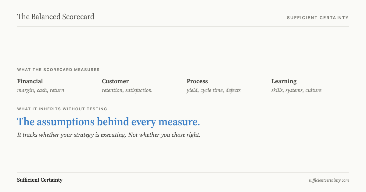
A balanced scorecard is a performance measurement system that translates strategy into objectives and metrics across four perspectives: financial, customer, internal process, and learning and growth.
What is a balanced scorecard?
For the plain-English definition, start with what is a balanced scorecard.
If you are deciding whether to use the Kaplan-Norton balanced scorecard, start with the question the model itself was never built to raise.
A balanced scorecard is a way to turn strategy into a short set of objectives and measures so people can see whether the strategy is being carried out. That is its real value. It takes a broad plan and forces an organization to say what success should look like in financial results, customer results, operational results, and capability building.
Robert Kaplan and David Norton introduced the idea in their 1992 Harvard Business Review article, after a one-year research project with 12 companies through the Nolan Norton Institute. Their complaint was straightforward. Financial statements tell you how you have done, often after the useful moment to correct course has passed. Managers also needed measures of the things that drive future performance, not just the score at the end of the quarter.
That was a genuine advance. A company did not have to wait for revenue or earnings to weaken before it noticed trouble. It could watch customer retention, process quality, lead times, defect rates, or workforce capability as earlier signals. The later Kaplan and Norton subtitle, translating strategy into action, gives the game away. The scorecard was built to communicate, align, and track. It was built to support execution.
That last point matters more than most guides admit. The scorecard begins after the strategic choice has already been made. It asks, if this is our strategy, what should we expect to see? It does not ask whether the assumptions behind that strategy are sound. It does not test whether the chosen objectives are the right ones, or whether the environment has shifted so far that the original logic no longer holds. The tool measures execution of a plan. It does not validate the plan itself.
That is why I treat the scorecard as useful and limited at the same time. If your strategy is sound, it can keep the whole business facing the same direction. If your strategy rests on a bad assumption, the scorecard can help you execute that mistake with great discipline.
The four perspectives
When the scorecard keeps showing that the plan is not turning into work, the issue may be a strategy that keeps missing execution, not another perspective or a better metric.
The four perspectives are best read as a story about how results are supposed to happen. Financial and customer face outward, asking what results the owners expect and what the market should experience. Internal process and learning and growth face inward, asking what the organization must do well and what people, systems, and habits need to change so the work holds.
In a manufacturer, that story is easy to see. Learning and growth might mean better supervisor judgment, stronger maintenance discipline, or cleaner production data. Internal process might mean higher yield, faster changeovers, and fewer handoff failures. Customer might mean better delivery reliability and fewer returns. Financial then shows up in margin, cash, and return. The order matters because the lower layers are supposed to drive the higher ones.
Strategy maps turn that story into arrows. Improve skills and systems, the logic says, and processes improve. Improve processes, and customers stay or buy more. Improve customer outcomes, and financial results follow. The visual is powerful because it makes strategy look coherent on one page. Boards like that. Executives like that. Consultants have made a good living from that.
The trouble is that arrows can look more scientific than they are. Hanne Norreklit's 2000 paper, cited more than 1,800 times, showed that many of these links are not clean causal claims at all. Some are logical links. Some are statements of purpose. Some are hoped-for consequences. A line from employee training to customer loyalty may be sensible, but sensible is not the same as proven.
Ittner and Larcker found the same weakness in the field. In their 2003 Harvard Business Review study, only 23 percent of companies had actually built and checked models showing whether their non-financial measures drove the financial outcomes they claimed to drive. The minority that did this work achieved return on assets 2.95 percentage points higher than the rest. That is the part people skip. The map is not proof. It is a hypothesis about how the business works. Until you test it, the neat arrows are still beliefs.
Where the scorecard stops
The balanced scorecard stops where strategy begins. It assumes the objectives inside each perspective are the right objectives. If that assumption is wrong, every measure can look healthy while the strategy wastes money, time, trust, or all three. A green pack can be a very efficient way to hide a bad bet.
Enron is the blunt reminder. In early 2001 it was the seventh largest corporation in the United States. Arthur Andersen had praised its risk management. Within months the stock had fallen from about $100 to pennies and the company collapsed. The lesson is not that measures are useless. The lesson is that a busy reporting system is fully capable of watching the wrong thing well.
I see the same failure in many so-called maturity scorecards. In Deciding we criticized measures that are "arbitrary and fuzzy" and tied to inputs rather than outcomes. Count the workshops, the committee meetings, the policy sign-offs, and you can always manufacture movement. Boards are then shown effort as if effort were evidence. I have seen teams report one hundred percent completion of actions that had no tested connection to the result they were supposed to improve.
This is why I keep pushing the argument upstream. The Universal Decision-Making Method starts before the measures are chosen. It forces the key assumption into the open while the Decider can still change the option, strengthen the control, or postpone the call. It also makes one person answerable for what the measure means and what should happen when it shifts, which is what real accountability requires. A green report without an owner is only a comfort item.
The scorecard is not wrong because it measures. It goes silent because it inherits the assumptions of the strategy it depicts, and inherited assumptions are often the least challenged thing in the room.
Test whether your green measures rest on assumptions that nobody has named. Start the Walk →
How to choose what to measure
When people ask me about balanced scorecard vs KPI, I tell them the distinction is smaller than it looks: one number or four perspectives, both still depend on a plan somebody must keep retesting.
If the first struggle is deciding which KPIs belong on the scorecard, the answer is the same: start with the assumption, not the template.
Choose measures by asking what decision they can still improve. If a number moves and nothing changes, it does not belong on the page, no matter how neat the quadrant looks. That one rule cuts through most of the clutter that accumulates in reporting systems.
I use three questions. What assumption does this metric test? What would change your decision if this number moved? When would you revisit? Most measures fail at least one of those questions. Some test nothing important. Some generate discussion but no action. Some survive year after year simply because no one wants the political trouble of removing them.
Stage 3 of the Universal Decision-Making Method gives me a blunt filter for this. Plot every assumption on an influence-versus-confidence grid. Critical and Important assumptions get monitored. Relevant and Limited assumptions usually do not. That feels severe to people trained on template scorecards, because they expect a full page and equal coverage. I do not. If an assumption has low influence on the outcome, leaving it off the scorecard is often the most disciplined choice you can make.
This is the opposite of the fill-every-box instinct that dominates most scorecard design. A measure with no owner and no action threshold is worthless. A measure chosen because a template expects one in that slot is nearly as bad. We do not manage risk to create reports. We measure to improve a decision while it can still be improved.
I have used scored models myself when they were tied to a clear purpose. In one client, we used a six-principle evaluation model and watched the score rise from 13.3 to 31.8. That number mattered because it was anchored to specific questions about how the organization actually made and checked decisions, and because the result changed what management did next. It shaped audit attention, management priorities, and where further work was needed. That is very different from issuing a generic maturity badge and pretending the badge proves competence.
If you want the sequence, I set it out in the five steps of the Universal Decision-Making Method. That is also where data-driven decision making stops being dashboard worship and starts helping a Decider. Data starts helping only when somebody knows what the data is supposed to disprove.
A balanced scorecard example
For a full walkthrough with the assumption layer visible, see this balanced scorecard example.
I worked with a statutory body that would feel familiar to any operations leader running a multi-site business. It had budget reviews, activity targets, staff development measures, and a neat monthly pack spread across the usual perspectives. The numbers were tidy. The Purpose was not.
Its legislated prime function, the thing it existed to prevent, was receiving about 0.03 percent of the budget. The old scorecard measured activity everywhere else. The agency tracked budget adherence, stakeholder satisfaction, service volumes, and training completion across every perspective the balanced scorecard calls for. Most of it was green, which made the organization feel busy and responsible.
The hidden assumption was that if spending and activity were spread across the full range of functions, the prime function must be adequately covered. Nobody had asked the rude question: what is this function actually supposed to prevent? Once we asked it, the entire measurement system changed. Funding for that function rose from 0.03 percent to 0.5 percent of the budget, and the loss of life it existed to prevent fell by 60 percent within two years.
That is the only kind of balanced scorecard example I trust. It shows the old measures, the assumption beneath them, and the evidence that broke the assumption. In a manufacturing plant, the equivalent might be measuring schedule adherence, training completion, and budget discipline while never testing the one failure mode most likely to force a shutdown, recall, or plant closure decision. Start with the outcome that matters most. Then measure the conditions that make that outcome more or less likely. Do not begin with a template and hope the Purpose turns up later.
Common variants and applications
Variants are easy to build because the four-box shape travels well. HR teams can use retention and time to hire. IT groups can watch uptime and delivery. Nonprofits and public bodies can swap profit for mission results or public value. That flexibility helps explain why Bain found usage peaking at 66 percent in 2007. The form is adaptable, which made it attractive almost everywhere.
The weakness travels just as easily. A healthcare team can track patient outcomes, financial margin, process efficiency, and staff development with great discipline. If the working assumption is that shorter waiting times mean better outcomes, the scorecard may reward speed even when diagnosis quality, continuity of care, or case complexity is being mishandled. The measures will still look well balanced. They will simply be balanced around the wrong belief.
Government versions often drift even faster because activity is so easy to count. Inspections completed, consultations held, training delivered, response times met, all of it looks respectable in a report. The same gap sits underneath it: are those numbers detecting the failure that matters, or merely recording motion? A scorecard can be adapted to any sector. That does not mean the sector has solved the harder problem of choosing what deserves attention.
I made the same criticism of the IIA Three Lines Model. Once assurance is reduced to labels, people start tending the labels. First line, second line, third line, everyone has a box, a chart, and a reporting ritual. Meanwhile the real question gets lost: would any of this detect the failure mode that actually matters? When labels gain a life of their own, resources get misdirected toward watching things that no longer matter while the live weakness goes untested. That is why good strategic thinking sits upstream of the scorecard. The labels must serve the decision, not the other way around.
After a review, what to do after a KPI review checks whether reported performance still matches the work waiting to be done.
When to reopen the scorecard
Reopen the balanced scorecard when an assumption breaks, not when the calendar says quarter end. A review cycle is a convenience, not evidence. If the logic behind a measure has shifted, waiting for the next formal reporting round only gives the organization more time to be wrong with confidence.
Three tripwires matter most. First, the assumption behind a measure is falsified. Second, a leading indicator and a lagging one start telling opposite stories, for example output stays high while complaints, rework, or warranty claims rise. Third, the outside Context shifts so hard that the original measure no longer points at the same reality. Frequency should follow the volatility of the assumption, not a standard board cadence.
This is where most organizations go soft. Mankins and Steele found that companies deliver only 63 percent of the strategic performance their strategies promise. Fewer than 15 percent regularly compare actual results against prior forecasts. That tells you how backward-looking most reporting still is. The scorecard should be a forward-looking monitoring instrument, not a backward-looking report on activity already spent.
Roger Estall and I wrote in Deciding that monitoring has no value unless the right person sees the result and can act on it. I agree with that more strongly each year. The right place to define those tripwires is in the monitoring triggers of the decision itself, while the assumptions are still vivid and before reporting turns into routine. The next step after building a balanced scorecard is to tie those tripwires to each funded initiative, even when its measures stay green. If no owner is named, if no threshold is agreed, or if no remedial action follows, the scorecard is decoration.
Your scorecard shows whether the strategy is executing. It cannot show whether the strategy was right.
Work through your decisionNo sign-up. Just pick your decision and start.
Grant Purdy is the co-author, with Roger Estall, of Deciding (2020), and the architect of the Universal Decision-Making Method.