
In February 2013, the Department of Health told NHS trusts that the Friends and Family Test would give commissioners "an up-to-date and comparable measure" to benchmark providers, using Net Promoter scoring.
By the end of 2019 the test had collected more than 75 million pieces of feedback, and revised national guidance said its numbers were "not comparable between organisations". After an NPS survey, decide how much certainty the next decision needs, then check whether the score can carry it.
Net Promoter Score subtracts the share of customers answering 0 to 6 on a 0 to 10 likelihood-to-recommend question from the share answering 9 or 10.
NPS gives a board one number it will read and a reason to call customers back
The method's appeal was stated plainly from the start. In Harvard Business Review in 2003, Fred Reichheld argued that companies spent heavily on complex customer satisfaction tools and were measuring the wrong thing. His alternative was one question: how likely is it that you would recommend this company to a friend or colleague? Respondents answering 9 or 10 are promoters, 7 or 8 are passives, and 0 to 6 are detractors. The score is promoters minus detractors, anywhere from -100 to +100.
Run properly, the survey does several useful things at once. It is short enough that customers finish it, so volumes are high and the score can be tracked monthly or by touchpoint. The follow-up question, usually some version of "what is the main reason for your score?", produces comments in the customer's own words. Those comments often point to a specific fault, a confusing bill or a missed delivery window, that no internal metric had flagged.
The stronger survey teams close the loop. Detractors get a call back within days, frontline teams read their own comments, and recurring themes go into the improvement backlog. Compared with the cost and lead time of commissioned market research, the survey delivers fresh customer evidence every week, cheaply, in a form managers can act on.
It also gives the organisation a shared figure. Sales, service and product argue over the same number instead of three different ones, which is the kind of alignment data-driven decision making depends on. Tracked within one organisation, with one collection method, over a long enough period, the trend says something real about direction.
A customer who moves from 6 to 7 lifts the score, while one who moves from 7 to 8 changes nothing. The number responds only to movement across two thresholds, so a handful of respondents sitting near either line can shift it as much as a real change in experience.
None of that is in question. The difficulty starts when the number is asked to do more than signal direction: rank teams, set bonuses, or justify cutting a service.
Take the score movement your next budget or bonus decision rests on and write down how many responses stand behind it before treating the change as real. Start the Walk →
The score assumes the customers who answered speak for the ones who did not
An NPS figure is an estimate built from the customers who happened to answer. Every decision that uses it inherits a set of assumptions about those customers, and they are rarely written down.
The first is representation. If a segment's score rests on 40 responses from 4,000 customers, it describes those 40 people, and nothing in the survey says whether they resemble the other 3,960. Exit interview analysis carries the same assumption about who chose to speak.
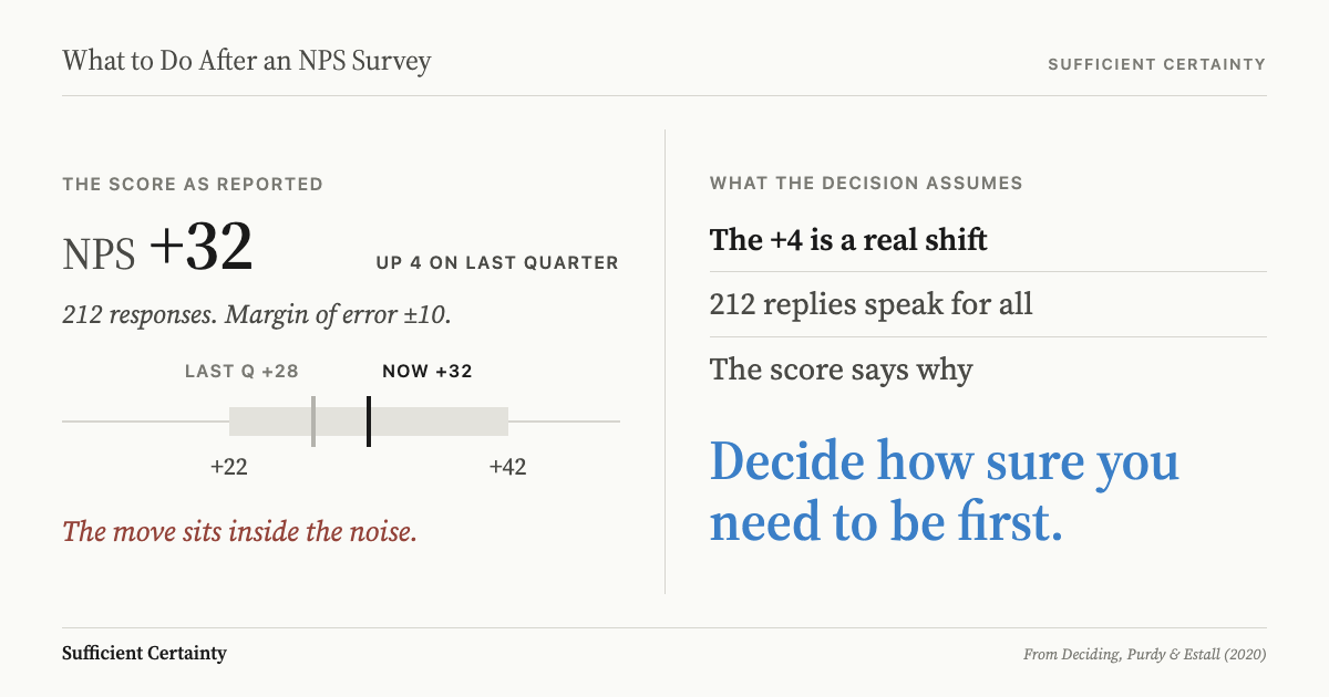
The second is precision. With half of respondents promoters and a fifth detractors, 200 responses give a 95 per cent margin of error of roughly 11 points either way. A quarter-on-quarter change between two samples that size needs to exceed about 15 points before it clearly clears the noise. Dawes (2024) found that the counting method itself adds variation compared with averaging the raw 0 to 10 answers, both between brands and for the same brand across survey waves.
The third is meaning. Dawes also reviews evidence of a weak association between saying you would recommend and actually recommending, so a rising score is not proof of word of mouth. It is the same gap a usability test leaves between how an experience felt and what it delivered.
The fourth is independence. Once a score or a response rate is tied to a bonus, a budget or a target, the people collecting it have reasons to change who gets asked and when. Comments carry a version of the same problem: theme counts describe what respondents chose to write about, not how often each issue occurs across the customer base. Each assumption is a limit on what the decision can safely ask of the number.
The NHS Friends and Family Test promised comparison it could not deliver
The Friends and Family Test began in April 2013 for acute inpatients and A&E patients in England. It asked how likely patients were to recommend the ward or department "to friends and family if they needed similar care or treatment", on a scale from "extremely likely" to "extremely unlikely".
The Department of Health's publication guidance set out what the score was for. It adopted the Net Promoter calculation and described the Friends and Family Test as "a simple, comparable test". Patients would use it "to make decisions about their care", and commissioners would use it to benchmark providers.
The same document named the weak points. Ward results were "likely to be more variable month to month due to the smaller number of responses", and "likely" answers, though absent from the formula, still counted in the total and were "highly influential on the final score". Money followed volume. The national incentive scheme for 2013/14 tied 40 per cent of the test's quality payment to response rates: at least 15 per cent in the first quarter and 20 per cent or more by the fourth.
After reviewing the first months of data, NHS England replaced the Net Promoter calculation in 2014 with a simple percentage who would recommend. The revised guidance of September 2019 went further. From April 2020 the recommend question gave way to "Overall, how was your experience of our service?"
The test, the 2019 guidance said, "is not designed to make comparisons across organisations". Response rates would no longer be calculated or published. It also warned that a focus on chasing them or comparing scores across providers "runs the risk of it being a 'tick box exercise'".
The reason given was local variation, including "different ways of collecting and analysing feedback, which mean we would not be comparing like with like". The 2013 guidance had allowed "a range of methods for data collection" from the start. The score was put to work comparing providers before anyone established it could carry the comparison.
Size the certainty before a score change funds, cuts or rewards anything
The Friends and Family Test could track a ward against its own past. Ranking providers and steering patient choice asked for far more. The time to see that gap was before the score was attached to payment and publication. NHS England's own review reached that conclusion in 2014, a year after launch.
The same checkpoint applies to any NPS survey. Before a score change is used to fund, cut or reward anything, write down the decision it is about to inform and how wrong that decision could afford to be. A ranking that sets a bonus pool needs more certainty than a dip that prompts a closer look at onboarding. How much information is enough depends on the decision, not on the dataset.
Then pull three things: the response base behind each segment's score, the confidence interval on the change, and a note of how respondents were reached and whose pay or budget depends on the result. If the interval is wider than the movement, the score is signalling, not proving.
Where the score falls short, the answer is rarely a bigger survey. It may be to use the comments to find a fault worth fixing, to treat the movement as a prompt for investigation, as set out in when a dashboard should change the decision, or to lower the stakes the number carries. The Universal Decision-Making Method treats this as a question of sufficient certainty: set the level the decision needs, then test the evidence against it.
An NPS survey reports how the customers who answered felt when they answered. Deciding what that justifies means sizing the certainty first.
An NPS report tells you the score moved. It does not tell you whether the move is bigger than the noise in the sample.
Work through your decisionNo sign-up. Just pick your decision and start.
Grant Purdy is the co-author, with Roger Estall, of Deciding (2020), and the architect of the Universal Decision-Making Method.